Gráficos básicos de línea con relplot() —-#
0:00 min | Última modificación: Octubre 13, 2021 | [YouTube]
[1]:
import matplotlib.pyplot as plt
import numpy as np
import pandas as pd
import seaborn as sns
[2]:
#
# Nuevo dataset de ejemplo
#
dots = sns.load_dataset("dots").query("align == 'dots'")

display(
    dots.head(),
    dots.tail(),
    dots.size
)
| align | choice | time | coherence | firing_rate | |
|---|---|---|---|---|---|
| 0 | dots | T1 | -80 | 0.0 | 33.189967 |
| 1 | dots | T1 | -80 | 3.2 | 31.691726 |
| 2 | dots | T1 | -80 | 6.4 | 34.279840 |
| 3 | dots | T1 | -80 | 12.8 | 32.631874 |
| 4 | dots | T1 | -80 | 25.6 | 35.060487 |
| align | choice | time | coherence | firing_rate | |
|---|---|---|---|---|---|
| 389 | dots | T2 | 680 | 3.2 | 37.806267 |
| 390 | dots | T2 | 700 | 0.0 | 43.464959 |
| 391 | dots | T2 | 700 | 3.2 | 38.994559 |
| 392 | dots | T2 | 720 | 0.0 | 41.987121 |
| 393 | dots | T2 | 720 | 3.2 | 41.716057 |
1970
[3]:
#
# Color basado en una columna numérica.
#
sns.relplot(
    x="time",
    y="firing_rate",
    hue="coherence",
    kind="line",
    data=dots,
    ci=None,
)

plt.show()

[4]:
#
# Color basado en una columna numérica y separación por clases. Note que el
# esquema de colores es lineal y no permite visualizar bien las diferencias.
#
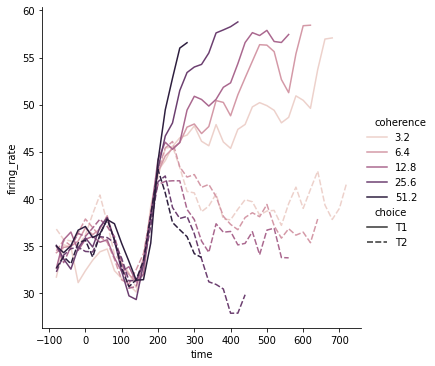
sns.relplot(
x="time",
y="firing_rate",
hue="coherence",
style="choice",
kind="line",
data=dots,
ci=None,
)
plt.show()

[5]:
#
# Definición de una escala logaritmica para los colores
#
palette = sns.cubehelix_palette(
    light=0.8,
    n_colors=6,
)

sns.relplot(
    x="time",
    y="firing_rate",
    hue="coherence",
    style="choice",
    palette=palette,
    kind="line",
    data=dots,
)

plt.show()

[6]:
#
# Alternativa: modificación de la forma de normalizar la paleta de colores
#
from matplotlib.colors import LogNorm

palette = sns.cubehelix_palette(
    light=0.7,
    n_colors=6,
)

sns.relplot(
    x="time",
    y="firing_rate",
    hue="coherence",
    style="choice",
    hue_norm=LogNorm(),
    kind="line",
    data=dots.query("coherence > 0"),
)

plt.show()
[7]:
#
# Cambio del grosor de las líneas usando una columna numérica
#
sns.relplot(
    x="time",
    y="firing_rate",
    size="coherence",
    style="choice",
    kind="line",
    data=dots,
)

plt.show()

[8]:
#
# Cambio del grosor de las líneas usando una columna categórica
#
sns.relplot(
    x="time",
    y="firing_rate",
    hue="coherence",
    size="choice",
    palette=palette,
    kind="line",
    data=dots,
)
plt.show()
